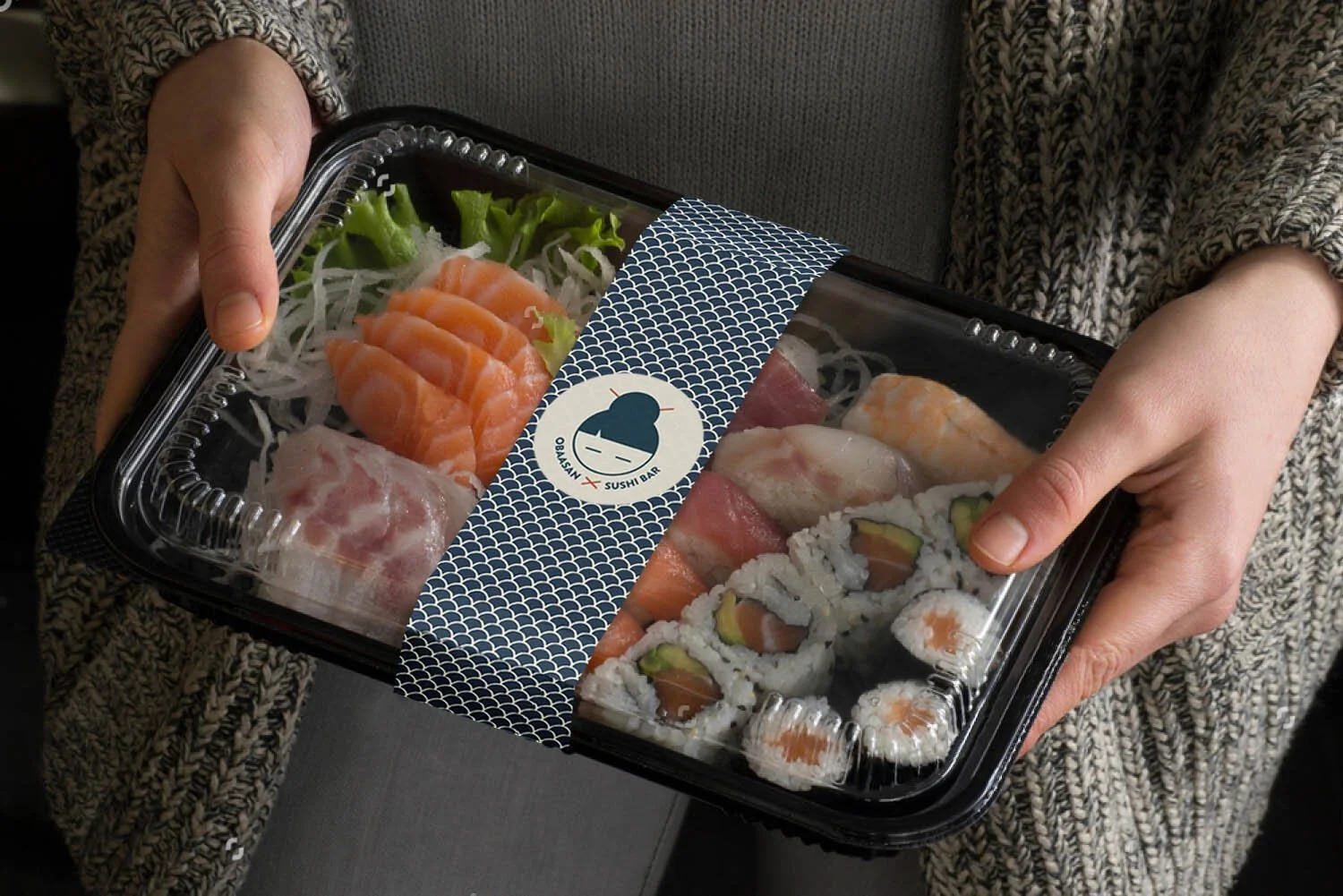
obaasan sushi bar
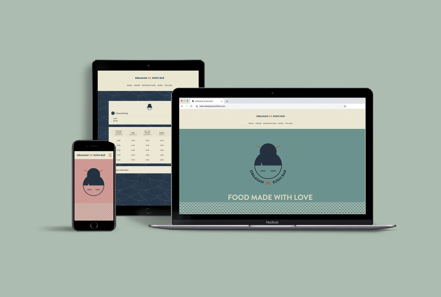
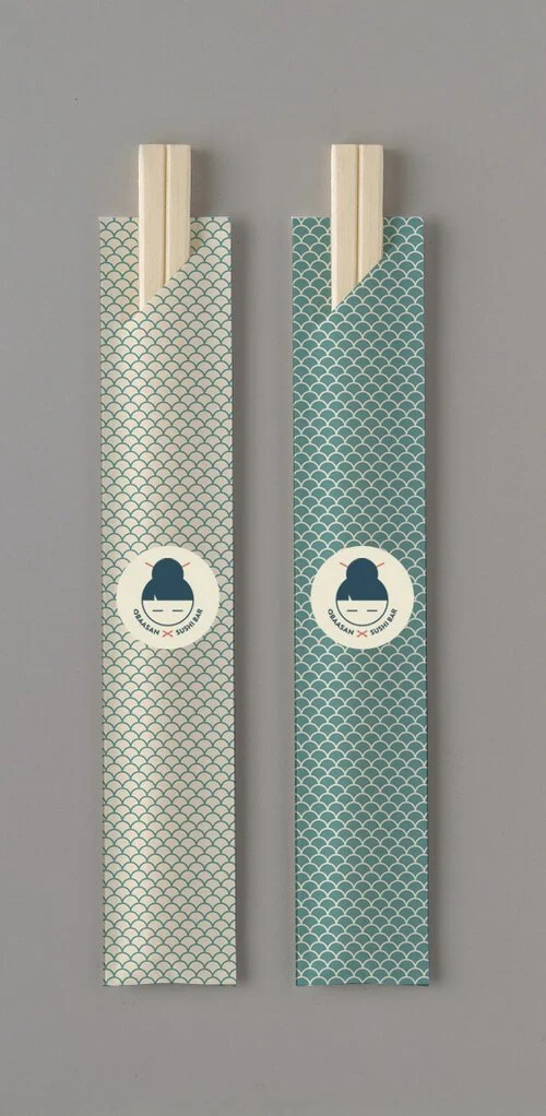
Brand identity for a restaurant.
CLIENT —
Personal Project
MY ROLE —
Graphic design, Branding
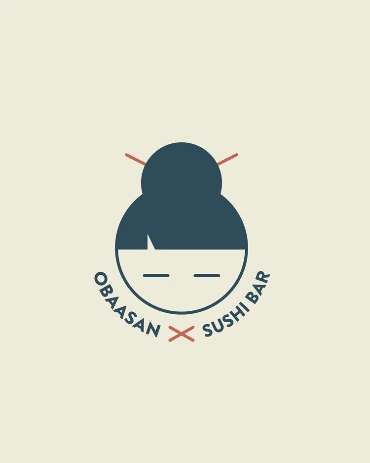
Obaasan Sushi is commited to reinvent the traditional tastes of the Japanese cuisine. With the ambition of bringing back the joy of eating our grandmother’s meal, Obaasan’s innovative menu combines traditional recipes with exciting new flavours.
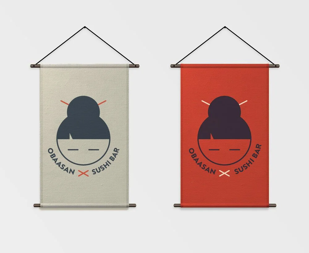
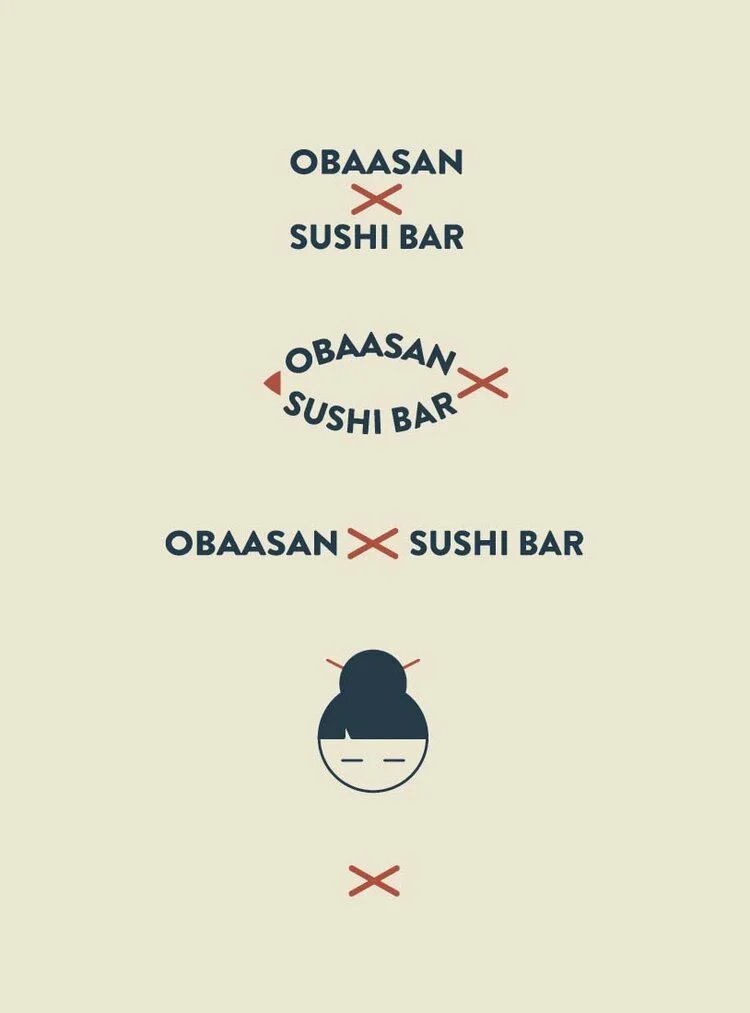
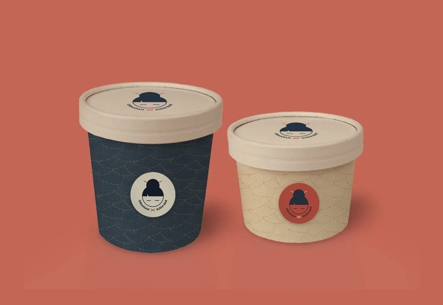
The logo represents the japanese word ‘obaasan’, which means grandmother. Grandomther as a symbol of food made with love. Food that we can always trust and will never disappoint us, which is Obaasan Sushi Bar’s utlimate goal. The red sticks used for the hair bun are also used as a methaphor for chopsticks. The simple shapes and the geometric typography chosen, give a modern and friendly look, which emphasizes the young and innovative spirit of the brand.